The USMS website has undergone several changes since its inception in 1996. There have been two wholesale redesigns of the website look and feel, plus a number of incremental changes in between the major redesigns. Below are thumbnails of each phase of the journey. Click through on any thumbnail to see a blown-up image of the website at the chosen time.
The usms.org website was first launched in September of 1996 at the annual convention. The 1996 Long Course Nationals results were published with this launch, the first time our national meet results were ever made available online. The screenshot at left is actually from April of 1997, but the overall look of the site had not changed between the launch and that date.
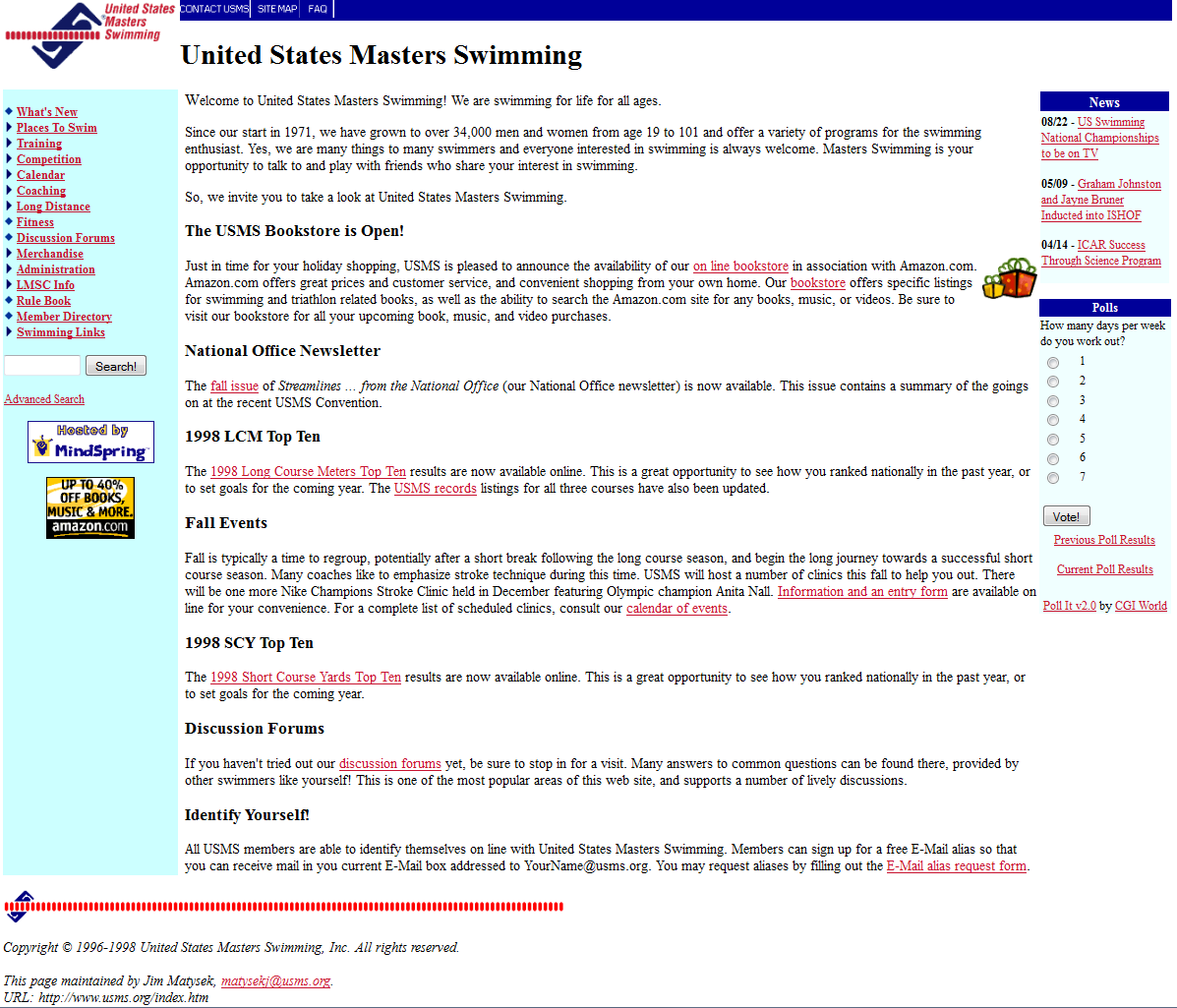
 December 1998 - First Major Redesign
The web was changing fast in the late 1990's, and the USMS website underwent a major redesign just two years after the initial launch. This redesign got rid of the background image and added top and left-side navigation bars. It also added the ability to include a series of recent newsworthy blurbs in the body of the home page as well as press release links and a fun poll that was periodically changed to the right side of the page.
 February 2005 - Second Major Redesign
After a long spell of using the same overall page design for the website, a new design was launched in 2005. This design featured tab navigation with drop-down menus at the top of the page, localized navigation within each section on the left side of the page, advertisements for our sponsors on the right side, and a search box and breadcrumb trail just above the content in the center of each page. Along with these cosmetic changes came a host of new back-end tools to drive the new site. Our own custom content management system (CMS) was created to drive all the navigation elements and allow for creation of database-driven content for the body of the page.
This version reflects several more minor changes that were introduced since the last major redesign. The new USMS logo is now featured, the color scheme has changed a bit, the overall page is now left-justified with a maximum width applied, and some changes have been made to the content of the left and right side navigation bars and auxilliary content found there.
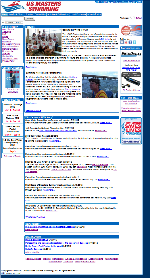
 September 2012 - Minor Updates
This is the version available in September of 2012 just prior to launching our third major redesign. There have been some minor updates over the years leading up to this version. These updates revolve around the left and right side navigation bars and include the ability to feature upcoming USMS national championship events, a prominent Join/Renew button, links for our social media outlets, and a Swimming Saves Lives logo and link. In addition, the latest articles and press releases are now shown at the bottom of the home page center content.
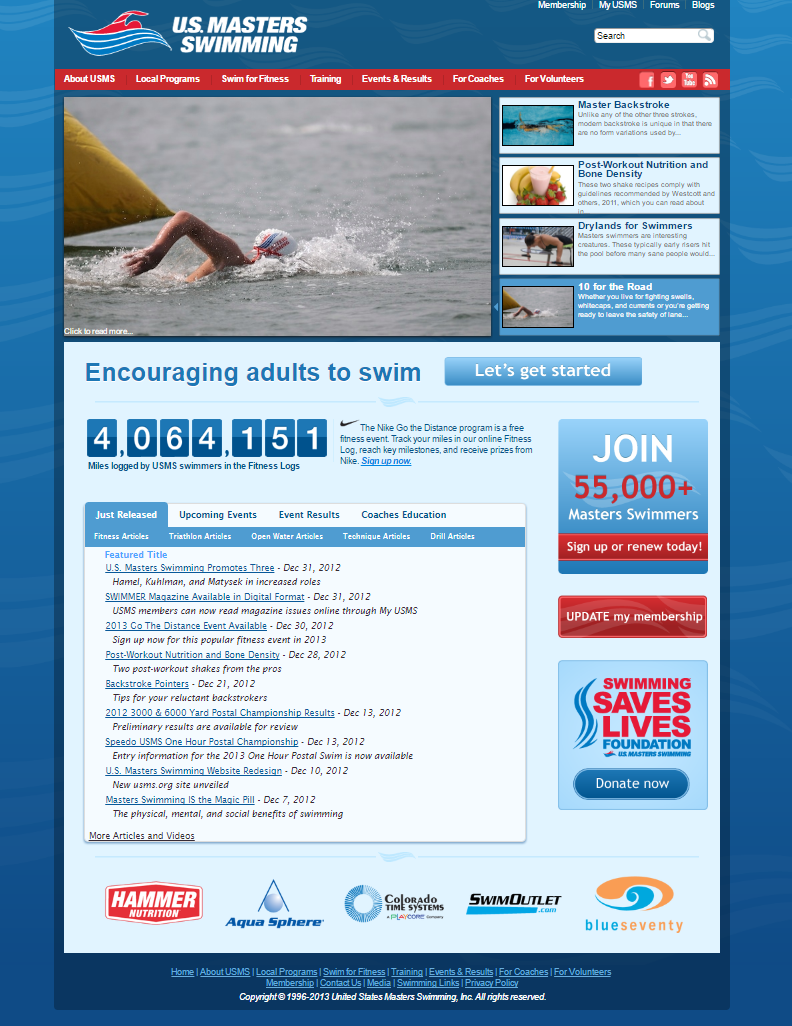
 December 2012 - Third Major Redesign
In December of 2012, we launched the third major redesign of the USMS site. One of the main focuses of this redesign was to make the site more visually appealing while retaining the major elements of the site navigation. The home page now features recent articles with compelling photos and also provides links to other recent updates via text links. Our social media links were also brought more into focus by featuring them in the top navigation bar.
 February, 2015 - Minor Updates
This version reflects several more minor changes that were introduced since the last major redesign. In keeping with our modified logo style guide, a white USMS logo is used at the top of the pages. Our social media buttons were elevated above the main navigation bar for greater visibility, which also allowed for expanded offerings in the main navigation bar to better represent the organizations priorities and new programs.


